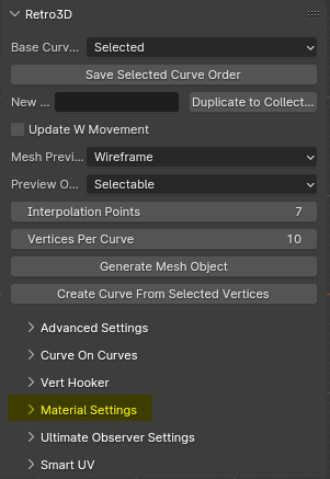
Material Settings
Retro3D Toolkit: Material Settings Guide
Welcome to the Material Settings panel of the Retro3D Toolkit, a streamlined tool designed to help simplify the process of assigning base colors to objects during the modeling phase in Blender. This panel provides an intuitive way to quickly apply solid colors to your 3D models, serving as a starting point for further texture and material development.
Accessing the Material Settings Panel
The Material Settings panel is integrated into Blender's 3D Viewport UI and can be found under the 'RETRO3D' tab, as a sub-panel of the main Retro3D settings.
Using the Material Settings Panel
The Material Settings panel is straightforward and easy to use:
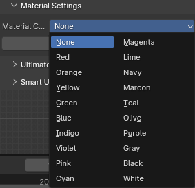
- Select a Material Color: Use the drop-down menu to choose from a variety of preset colors for your material. This will define the base color of your object.
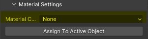
- Assign To Active Object: After selecting your desired color, click the "Assign To Active Object" button. This will apply the chosen color as a simple material to the currently selected object in your 3D scene.
Why It's Important
The Material Settings panel serves several important functions in the 3D modeling workflow:
-
Rapid Prototyping: Assigning base colors to objects allows you to quickly visualize the overall structure and composition of your scene without getting bogged down in complex material setup.
-
Blocking Out Shapes: Solid colors help to distinguish different elements in your model, making it easier to focus on the basic forms and proportions before diving into detailed texturing.
-
Streamlined Workflow: By providing a quick and easy way to assign base materials directly within the 3D Viewport, this tool helps to keep your workflow efficient and uninterrupted.
Conclusion
The Material Settings panel in the Retro3D Toolkit is a valuable asset for any 3D artist working in Blender, offering a simple yet effective solution for assigning base colors to objects. By incorporating this tool into your modeling process, you can streamline your workflow, rapidly prototype ideas, and lay a solid foundation for further material and texture refinement.
Color Overview
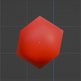
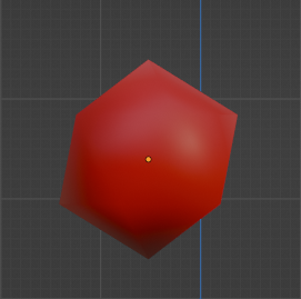
RED
RED, great for representing passion, energy, and intensity.
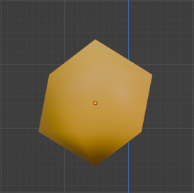
ORANGE
ORANGE, great for representing enthusiasm, creativity, and warmth.
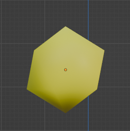
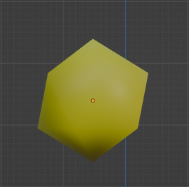
YELLOW
YELLOW, great for representing happiness, optimism, and intellect.
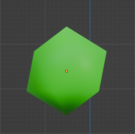
GREEN
GREEN, great for representing growth, harmony, and freshness.
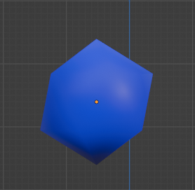
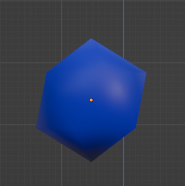
BLUE
BLUE, great for representing stability, trust, and serenity.
INDIGO
INDIGO, great for representing intuition, perception, and integrity.
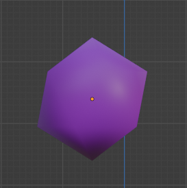
VIOLET
VIOLET, great for representing royalty, nobility, and luxury.
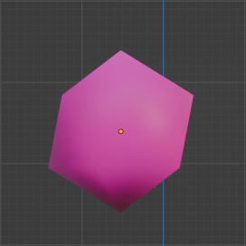
PINK
PINK, great for representing love, compassion, and nurturing.
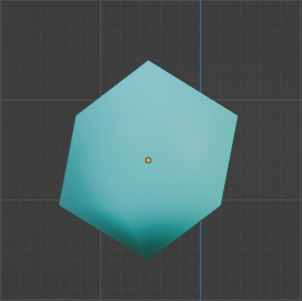
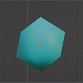
CYAN
CYAN, great for representing tranquility, balance, and clarity.
MAGENTA
MAGENTA, great for representing harmony, emotional balance, and non-conformity.
LIME
LIME, great for representing freshness, youthfulness, and vigor.
NAVY
NAVY, great for representing importance, confidence, and power.
MAROON
MAROON, great for representing controlled power, creativity, and courage.
TEAL
TEAL, great for representing sophistication, wisdom, and spirituality.
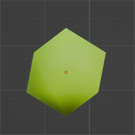
OLIVE
OLIVE, great for representing earthiness, stability, and traditionalism.
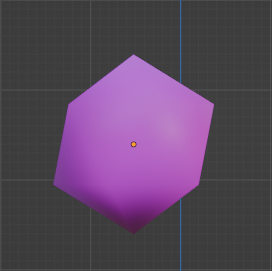
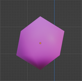
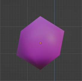
PURPLE
PURPLE, great for representing mystery, spirituality, and royalty.
GRAY
GRAY, great for representing neutrality, balance, and practicality.
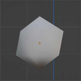
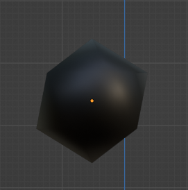
BLACK
BLACK, great for representing power, elegance, and mystery.
WHITE
WHITE, great for representing purity, innocence, and cleanliness.